Selected Work
A Brand, Clearly Expressed
.png)
.png)
.png)
the fresh vida
a LOGO design project
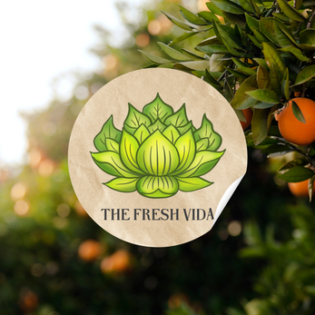
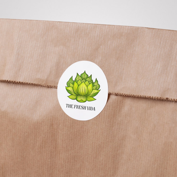
The creative direction for this logo was based on a unique and playful design request: to combine the elegance of a lotus flower with the earthy, familiar form of a head of lettuce.

Design Process & Intent:
Illustrative Style: I went with a hand-drawn approach to give the logo warmth and an artisanal feel, echoing the personal and homemade nature of the client’s work.
Blended Symbolism: The lotus petals are designed to flow into the leafy texture of lettuce, creating a layered, harmonious blend of the two elements. It’s both symbolic and literal—a nod to growth, renewal, and nature’s abundance.
Color Story: A bright, fresh palette of greens was chosen to bring life and vibrancy to the design, making it pop across various backgrounds.
Typography: Clean and understated serif font for balance, allowing the illustration to take center stage while keeping the name grounded and clear.


.png)
Why I loved this project:
This project was pure creative joy. Give me a wild idea—like a lotus meets lettuce—and I’m all in.
It’s that sweet spot where imagination and design collide, and I live for it.
Designed by Liz
I’m the founder and creative behind CHNL. Each project here was shaped through collaboration, trust, and a lot of thoughtful decision-making along the way.


.png)


